Unifying the Digital Experience of a Commercial Insurer
One platform, one design language, from brand awareness through claims and renewal.
Mid-size commercial insurer
Role
VP of UX
Timeline
2021–2024
Outcome
SUS 61 → 85, NPS ease of use 83 → 91, customer communication up 35%.
The business problem
The company lacked a unified experience, which produced a steady stream of one-off solutions, fragmented customer communication, and too much employee time spent resolving needs that customers should have been able to handle themselves. The major external and internal digital experiences were outdated and no longer met user needs or business demands.
How we understood it
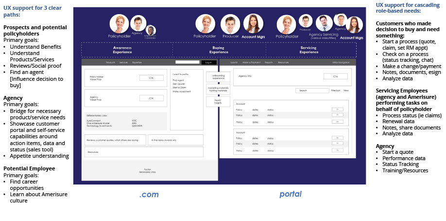
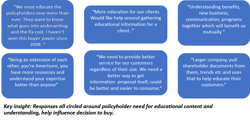
We ran UX audits of both sites alongside usage data, voice of the customer, and voice of the employee. That work made the primary goals of each role visible — from brand awareness through service interactions — and confirmed the need for a single technical solution spanning public and private sites. We validated assumptions with customer interviews, industry research, employee interviews, system usability scoring, and task-based A/B testing.
The strategic decision
Rather than redesign screens, we partnered with engineering to define a core platform that carries the business's capabilities: modern security and cloud management underneath, enterprise capabilities like notifications and workflow in the middle, and the agency and policyholder experience on top. A reusable design language system let teams build and prototype faster while retiring technical debt.
A data-based approach
After initial discovery, we used data to test our own assumptions rather than defend them.
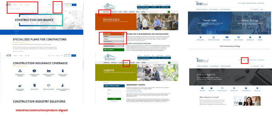
- Customer interviews and industry (competitor) research
- UX audit paired with real usage data
- Employee interviews and system usability scoring
- Task-based A/B testing through a testing platform to refine findings
The north star
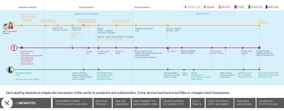
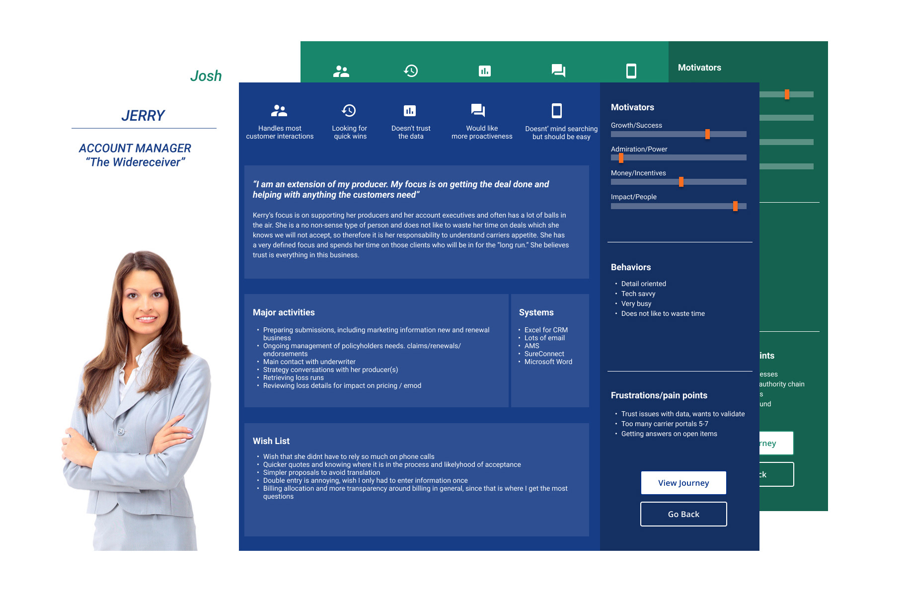
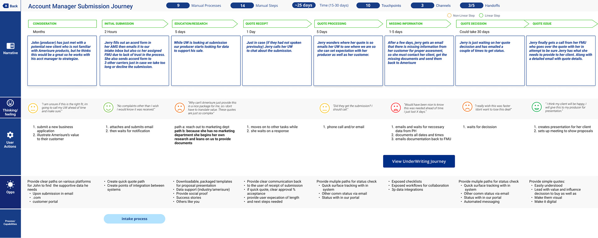
We mapped journeys across three moments of truth — the decision to purchase, filing a claim, and renewal — and used personas and prioritized journeys to shape the MVP and the post-launch roadmap.
The experience that shipped
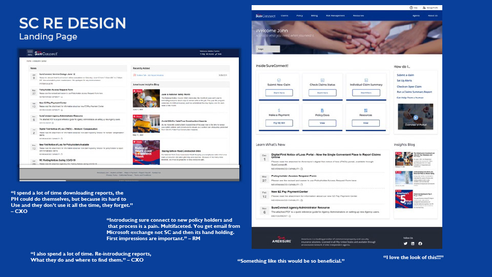
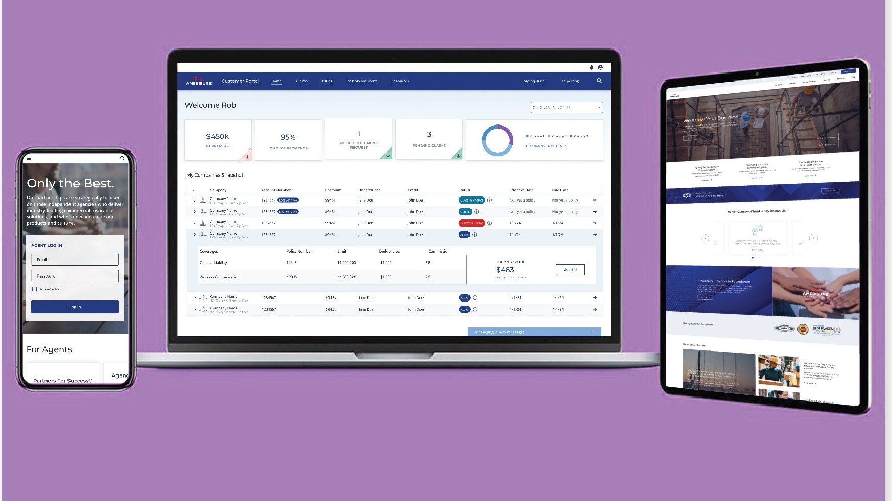
Phase one unified the UI across the public and private platforms on one design language and one platform, and cleared the paths that mattered most day to day — including streamlined report downloads. Phase two, aligned to backend modernization and the digital strategy.
Results
A cohesive experience across internal and external users on a single platform and one design language.
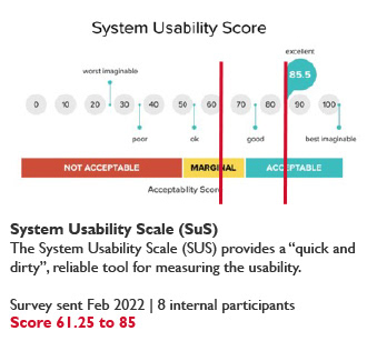
- System Usability Score increased from 61 to 85
- NPS ease of use 83 → 91, self-service 83 → 90, agency effectiveness 73 → 89
- Customer communication increased 35%
- Reusable design language accelerated experience development
Next use case
Building a Digital and CX Strategy
Selected artifacts